Dear readers, With the launch of e-newsletter CUHK in Focus, CUHKUPDates has retired and this site will no longer be updated. To stay abreast of the University’s latest news, please go to https://focus.cuhk.edu.hk. Thank you.
Ouroboros of Pisces

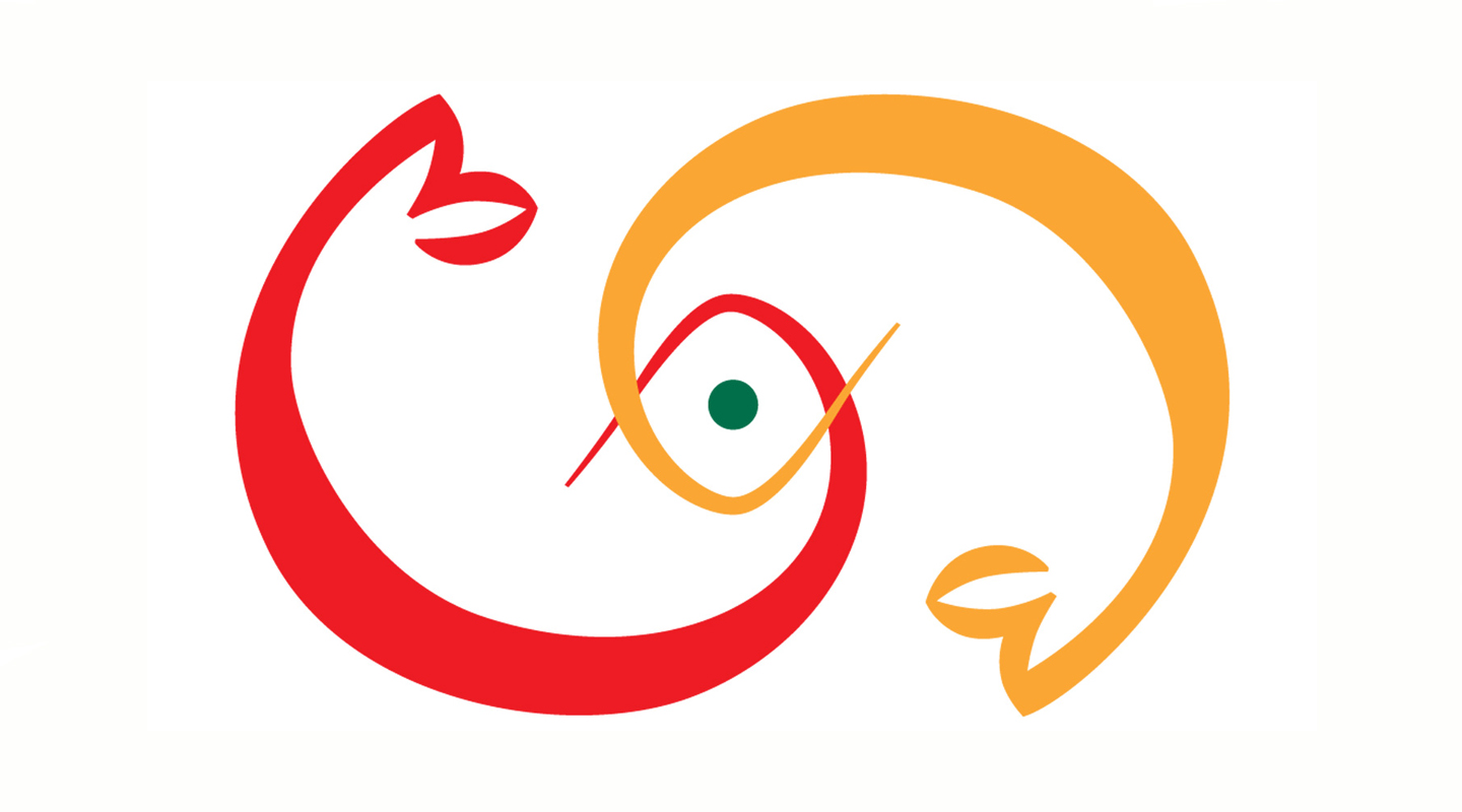
The logo of T.T. Ng Chinese Language Research Centre of the Institute of Chinese Studies consists of two fish sketched in simple lines. It was inspired by the koi in the pond of the Institute. Red and orange are typical colours of koi and the two fish come together in a green eye which is of the same hue as the Institute’s emblem. The close relationship between the Centre and the Institute goes without saying.
T.T. Ng Chinese Language Research Centre did not have any logo when it was originally founded in 1966 and subsequently renamed in 1978 and 1980. In 2011, Prof. Tang Sze-wing, director of the Centre, proposed to create a logo to showcase the Centre’s research foci and image. ‘I came up with the idea of the Pisces and Ms. Mian Cham, then research assistant, did the artwork. The simple lines of the logo signify the Centre’s modest and pragmatic approach to achieving academic excellence. The curving and coiling koi underscore the Centre’s determination to become a vigorous and creative academic hub. Human language shares the same fluidity and vitality of the koi. The study of language, be it pure or applied, also leads one into a realm of endless wonders and insights.’
The interlocking Pisces may remind one of the ouroboros, the ancient symbol of the Egyptians and the Greeks which depicts a snake or dragon eating its own tail. It symbolizes the unity of all things, physical and spiritual, engaged in a perpetual cycle of change and re-generation. The koi that twirl in the pond of the Institute of Chinese Studies and twine in the logo of T.T. Ng Chinese Language Research Centre are pregnant with no less cultural and philosophical symbolism.
This article was originally published in No. 484, Newsletter in Oct 2016.