Dear readers, With the launch of e-newsletter CUHK in Focus, CUHKUPDates has retired and this site will no longer be updated. To stay abreast of the University’s latest news, please go to https://focus.cuhk.edu.hk. Thank you.
Homage to Hexagons: Centre for Promoting Science Education

Often called ‘nature’s perfect shape’, hexagon can be seen in honeycombs, snowflakes and turtle shells. It also abounds in the artificial world. Footballs, metal nuts and Beijing’s ‘Water Cube’ aquatics centre bear its form. The Centre for Promoting Science Education under the Faculty of Science has also taken advantage of this six-sided shape and designed a logo that is pleasing to the eye and rich in implications.
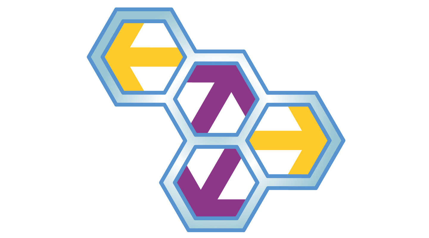
The logo features a cluster of four regular hexagons with double blue outlines. Gold and purple arrows pointing left and right, up and down are filled diagonally in each cell, a vivid demonstration of the Centre’s mission to reach out from the ivory tower and promote science to the wider public. Hexagon was chosen to represent science for a good reason: it is ubiquitous in our physical world.
In geometry, hexagon is studied as the most efficient shape for covering a large flat area without gaps, and the total length of all the cell perimeters is the least. That is the reason why the cells of a honeycomb are hexagonal so that the worker bees can use the least amount of wax to build the walls to store the most honey.
In organic chemistry, hexagon is used to illustrate benzene. It may not be a household name, but benzene is one of the most widely used chemicals involved in manufacturing products we use daily, such as detergents, plastic and rubber. The organic compound with six carbon atoms is often depicted as a hexagon with a circle inside it.
A hexagon also has the best torque for mechanical engineering. This means a metal nut, for example, with more than six corners, would be vulnerable to being rounded off. A square nut is less likely to slip, but there would be less surface area applying force to the nut with four sides versus six. A hexagon can be easily wrenched as it is a perfect compromise between circularity and angularity.
In a popular TED Talk by Roman Mars, he laid out a set of tenets of insignia design: Keep it simple; Use meaningful symbolism; Use two to three basic colours; Be distinctive. It seems the Centre for Promoting Science Education has ticked all the boxes.
Christine N.
This article was originally published in No. 519, Newsletter in Jun 2018.